Alternatively titled “Answering all your burning questions about how I make my pics on Facebook all cutesy”!
this may not be the most organized tutorial post you’ve ever read – but hopefully it at least gives you a quick overview of what I use and gives you a jumping off point for your own creativity!
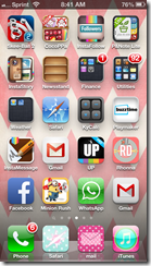
First – here is how clogged up my phone screens are. in the first pic you can see I used to be able to organize them into folders – but then Kealey got an ipod and our accounts are linked so now all the random apps that she downloads get put on my phone too and it screws up my organization! Plus I am just too lazy to sit and re-organize it all. Mostly the second reason.
So you have all my different photo apps, then a couple various ones on different screens. Most of the ones I use on a daily basis are paid apps. There are some great free photo editing apps out there – but none that i’ve found that fit all my photo editing needs. I believe most of the ones I use are $1.99 – I rarely pay more than $3 for ANY kind of app. But for the purposes of this post, I’m going to focus on the three main ones I use for most of my pictures.
First up is an ADORABLE app from Elsie – a former scrapbooking goddess back when I had time to scrapbook. I have always loved her fun style – and when she released an app for photos I’m pretty sure i was one of the first 10 purchasers! (also – because I use an iphone, all my links will be to the itunes store – i have no idea if these are available for android phones! sorry!)
a Beautiful Mess app (click on the picture)
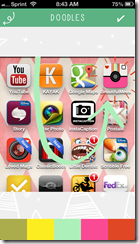
What does it do? Well – it adds some of the cute fun doodles – like the dashmarks and arrow in the picture above. Here’s a few screenshots of how I created this pic using this app:
Along the bottom you will see your choices (once you’ve loaded a picture in, which is pretty self explanatory once you open the app!) There are filters (mainly blown out black and whites, which is not my personal style, but others may like the filters included in this!), borders (I use the borders from this app a lot!), text to create your own message in cute funky fonts, doodles, and phrases. The control over the doodles and phrases is minimal at best – but if you like loud funky bright things – it works.
Basically you pick your doodle from a scrolling list of them (and there really are quite a few to choose from!) It puts it on your picture and you are able to drag it and resize it to where you want. They don’t rotate very easily, so you are somewhat stuck with whatever direction it gets pasted in.
and then once you’ve pasted your doodle in, you can scroll along the bottom for a few pre-determined colors. Again, not a whole ton of fine tuning available with the color – but when it doubt, white shows up well on most any picture and gets the job done!
I’m kind of doing this tutorial backwards because Beautiful Mess is usually the LAST step of my process – but it has the best arrows for what I’m needing so I did it first this time.
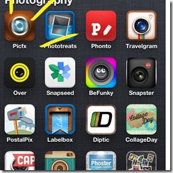
The one that I usually go into first is called “PicFx”. This is where I change the contrast/brightness and add a filter depending on the mood of the pic I’m going for. I usually use it to add some color to Kendall because she is typically pale as a ghost and usually glows bright white in any pics I take of her! Also in this picture are my “main” go to photo editing apps – they each have different filters, and sometimes if i just can’t get it right in PicFx, i’ll go to Snapster or PhotoTreats. Snapseed is great for landscape type pictures (mountains, beach scenes, great sunsets, etc.) and BeFunky has lots of controls available for personalization. Phonto allows you to import your favorite fonts from your computer to use on pictures, and Over has lots of great text options available to make your own text-written-on photos. But for now, let’s focus on PicFx. (click on pic)
And again – a few screenshots of how I use the filters included in this app
Your first option upon loading a picture (the buttons are teeny – but you get used to where to click for a new project) – you can choose to crop it square (which I usually do because many of my pics go onto Instagram also), or you can leave it full size. You can move the square around. Pro tip: typically those lines are used so you can frame your picture using the “rule of thirds” – fill one third with interesting subject matter, and leave the other two thirds as “white space”. Alternatively, place the focal point of your picture near one of the intersecting lines. Oversimplified explanation – but there you have it. so you crop your pic how you want it, then you get to the fun part!
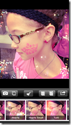
Across the bottom you will see a bunch of different “film” choices for adding just the right filter to your photo. You can click from filter to filter without actually committing to any changes, but you can see that it gives you a little preview of every filter right along the bottom. Once you have a filter you like, you can either click the stack with a + sign to add another filter on top of the one you just chose, or you can click the arrow to save your picture. I usually add a “bokeh” effect – (the little light bubbles), so I click the add another button, and scroll over to the “light” filters.
For this one, I picked small hearts.
and then hit save! once you are in the save screen, it gives you options to do different things – message it directly from the app, instagram it, send it to facebook, etc. Since I have one more app to run it through, I just save it. But those options are nice to have, and i’ve never had a problem with it crashing or not posting!
So lastly we go to where the real magic happens! This is the app you all really want to know about when you ask me how i get the cute words on them! It is by another scrapbooking goddess, Rhonna Farrer. she is the QUEEN of making cute instagram photos, and again, when i found out she had an app – I was all over it like white on rice. (click on the pic)
I could spend hours fine tuning my pics with this app. and sometimes I do. I RARELY, rarely rarely like NEVER post a pic without doing at least one of these things to it. The iphone camera is great – but it needs “oomph!” to me. And this app is how i’ve found the easiest way of “watermarking” my pictures for Kendall’s page.
first – its just gorgeous. When you open it up, this is the screen you first get. Sometimes I just sit and watch the pictures that are scrolling behind it because it is FULL of good inspiration. I tend to get stuck in my rut of how I use the app – but looking at how others use it challenges me on my own creativity with it. And this app can do a TON. If they started charging $10 for this app, i would STILL tell you to get it because it is THAT amazing in my mind!
So from the top you see your two choices are “T” to add text on your own, or the design icon, which opens up the panel on the left. SO many pre-designed icons/word art/etc to choose from. Again, play around with it – look at everything, see what fits your photo’s mood and theme. The ability to resize/tilt and make things fit in the space you have for it is amazing. And then once you have it where you want it, you can fine tune it even further as needed.
If you can’t pick a color that shows up well enough with your photo, you can add a shadow/outline, change the transparency so it isn’t overbearing and takes focus away from your photos, etc.
And then….
VOILA!!!! your final product!!!
I could do SO many other tutorials on this subject of iphoneography – and maybe i will try to make it a regular feature if you all enjoyed this! I can go into some of my other apps that i’ve found that i love!
And to make this post extra fun- I’m going to give away one of each of these apps! All you have to do is leave a comment on this post telling me
which of these apps do you want the most
that you have liked the terra talking blog page on facebook
that you have liked the Hope for Kendall page on facebook (both of these are linked on the right hand side of the page if you are viewing from a computer)
and you get a bonus entry if you share this blog post on your facebook walls. Another bonus entry if you pin it to pinterest!
I will pick a winner from the comments on here tomorrow (monday) night, September 23 at 10pm central time. And announce the winner on Tuesday morning here on my blog!
Hope you all have enjoyed this little glimpse into the crazy chaos of how I edit pics for facebook/instagram!
Have a beautiful Sunday! I know we will! We are gettin the boot outta the ICU and heading HOME!!!!! 😉 I’m off to pack up!
keep on keepin on –
T-crest.


i love to edit my daughters pictures if i won one of these i would want to win the rhonna designs but any of them are cool. iv liked your both of your pages and shared it on my wall
Charity – you are the lucky winner!!! Can you send me a message through facebook on the Terra Talking page – or email me at terrarist101@gmail.com – I need your itunes email address to send you the app – and let me know for sure that it is the rhonna one you want!
Thank you all for playing!!!
terra
I am sooo excited for you to share this info – I am obsessed w/ pics, but I’ve always been too overwhelmed by the options to try much “advanced” on my phone!
Oh, my heart: Rhonna Farrer!!!
& of course I’m a TT & H4K on FB like-ee 😉
I love taking photos with my iphone and need done good apps for editing! I would really love the Rhonna Designs app. It looks awesome!!! I love the pics you post…honestly never even thought you created them in your iPhone.
Definitely a likee of both FB pages!!! Thanks for sharing this info!!!
I’m totally not patient. So, I bought the Rhonna Designs one and have been playing all afternoon!! I don’t necessarily need to win that one now… but just want you to know I’ve been definitely wondering about which app you used for the swirly and wordy thingies. xoxo – Thanks for the post!
I love taking photos, but have never actually edited them. Never known what apps would be good and do what I wanted to do. I would love any of them! I have liked both your pages on facebook and follow Kendall’s story. I am also medically complex and we have some similarities.